3. The Easy Steps to Enlighten Your Desktop
You'll have to:
Update the FreeType library package on your system with one compiled with BCI support.
Install the Webcore Fonts package (a.k.a. Microsoft fonts).
Follow the instructions below on how to configure your desktop and common applications.
3.1. Get a Better FreeType RPM
FreeType compiled with BCI presented much better screen font rendering results.
Get RPMs for your distribution here:
Fedora 5 RPMs by Cody DeHaan.
CentoOS or Red Hat Enterprise Linux 3 and 4, and Fedora 3 and 4 RPMs.
Mandrake RPMs through the Penguin Liberation Front website. The package name is libfreetype6.
Debian Sarge users have the BCI enabled FreeType from the "testing" and "unstable" package repositories. Next stable Debian version will include it as their default. The Debian package name is libfreetype6.
If you use one of these distributions, but on a platform that binary RPMs are not being provided, you can easily compile your own (even if you don't have any software compilation skills) following the instructions on Appendix B.
WE WILL ACCEPT CONTRIBUTIONS of distribution specific FreeType repackaging, so if you can contact us, we appreciate.
If you are interested in repackaging your own FreeType, see how we repackage the Fedora Core and Red Hat RPMs with BCI on the Appendix A as a reference.
3.2. Configure Your Desktop
General Guidelines
The main idea is to use good hinted fonts all around. As a general rule, we'll use Tahoma 8pt for desktop widgets, LucidaTypewriter 8pt for monospace text, and Verdana 8pt, 9pt or 10pt for fluent text reading or web surfing. These are the default font sizes on a Microsoft Windows desktop, and they look good on a 1024x768 screen. If you have a better screen resolution (1280x1024, 1600x1200) our suggestion is to stick with these fonts but increase their sizes.
We choose these fonts, specially Microsoft's Tahoma and Verdana, because they look perfect at small sizes (8pt, due to their excellent hinting), providing a more efficient screen utilization. They'll make your desktop look beautiful, professional, clean and comfortable. These fonts were designed for this purpose.
For window titles or text that will appear in bigger sizes, you may choose whatever you want because bigger sizes hinting are not so relevant.
3.2.1. A Note About Anti-Aliasing
Anti-Aliasing is a technique used to reduce the "steeper" effect on low-resolution medias, so it can be used to improve the quality of text on the screen. It is also used to blur the imperfections of bad hinted fonts at small sizes. For desktop widgets (usually with small size), some people think it makes the desktop look dirty.
So a practical conclusion we found is to use Anti-Aliasing for sizes bigger than 10pt, and use good hinted fonts for smaller sizes without Anti-Aliasing. Currently the best hinted fonts you can find, as we cited before, are the ones found in the Webcore font package.
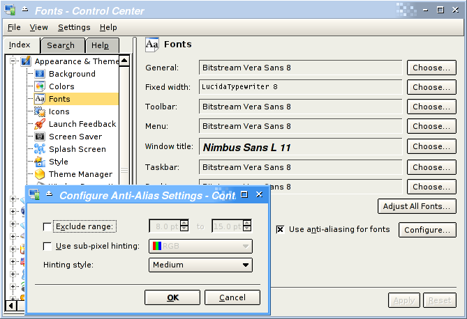
3.2.2. KDE
To configure KDE, use the Control Center (kcontrol in the command line). This is how I have it configured.
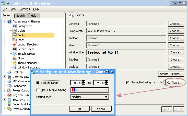
So we basically chose Trebuchet 12pt as the window title font, the bitmap font LucidaTypewriter 8pt for fixed size text, and Tahoma 8pt for everything else, which includes menus, buttons, etc. The 2 first should follow your taste, but Tahoma 8pt for all the rest is the optimal configuration, also used by MS Windows 2000 and XP.
One other thing to note is that I disabled anti-aliasing for font sizes up to 9 points. Look at the entire dialog and see how all text is clearly rendered, looks clean precise and professional.
Konqueror (KDE's browser and file manager) also needs font configuration for beautiful web browsing and file management.
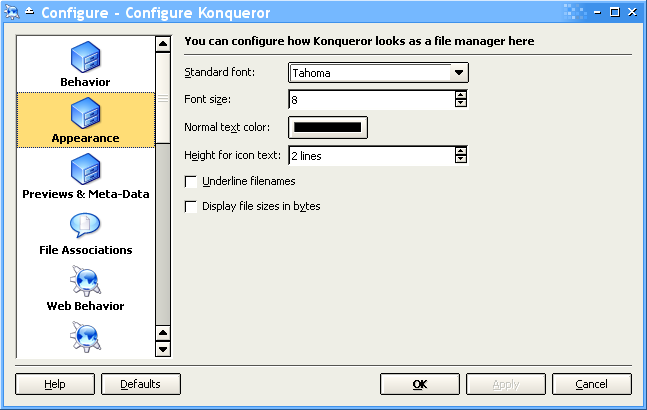
We used the same Tahoma 8pt for rendering the list of files in Konqueror's window, because Tahoma was simply designed with this purpose in mind, with 8pt being its most important size, with no need of anti-aliasing to be clear and beautiful.
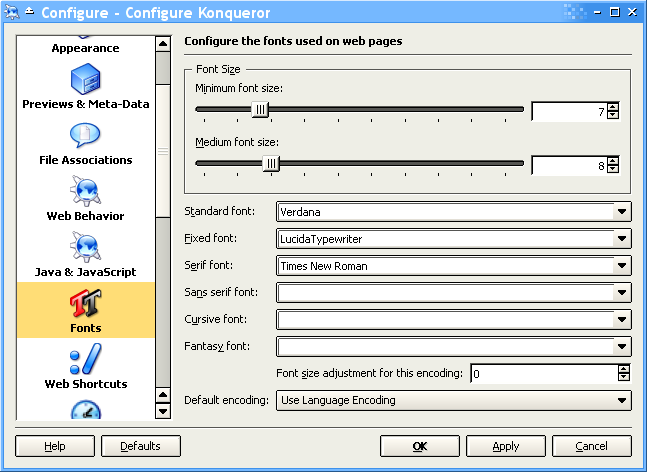
And this is finally for web browsing. We are using Verdana as the general font because it was simply designed for the purpose of fluent text reading on the screen. And the old LucidaTypewriter when a web page requested a fixed size font. Some may choose fonts like Courier or Bistream Vera Mono here.
We left all other fonts blank, to let the page choose it. But you may use Times New Roman as the Serif Font. Read more about serif fonts in Section 7.2.2.
The sizes of the fonts for browsing are a bit personal and depends on how healthy are your eyes, and the resolution of your screen. In my 1024x768 screen I use default size as 8pt, and I don't want web pages to use sizes smaller than 7pt. In the end of the day, to set the size is not so effective because modern web pages use to set them with absolute values. So it is more practical to use the browsers menu to "zoom" the page you are currently seeing.
One more thing to note is the Default Encoding. This is a quite complex subject that deserves an entire HOWTO, but it is generally OK to leave it as the Language Encoding. You may need to change it if you frequently browse pages with non pure ASCII (international text) made by irresponsible webmasters that still don't use UTF-8 for the web. But here also it may be more practical to use the menu to set the encoding for the current page you are browsing.
3.2.3. Gnome
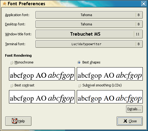
We'll use our generic rules here too: Tahoma 8pt for everything. Navigate preferences menu to invoke the following dialog or just run gnome-font-properties from the command line.
3.2.4. OpenOffice.org
As of Fedora Core 3 time, OpenOffice.org 1.1.2 has look (but not feel) integration with KDE and Gnome. This means that your environment should tell OOo how to use widget fonts. But we found it didn't really work. With further investigation we found that only the non-AA configuration we made was not propagated to OOo. So we used OOo's own dialogs to change it.
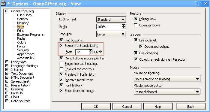
So we basically selected , menu, and in the View section we enable OOo to do anti-aliasing at font sizes beginning with 12 pixels (approximately 9pt), and the result is what you can see above: clean and comfortable widgets with Tahoma 8pt.
3.2.5. Mozilla Firefox
Mozilla Firefox follows the same Konqueror rules.
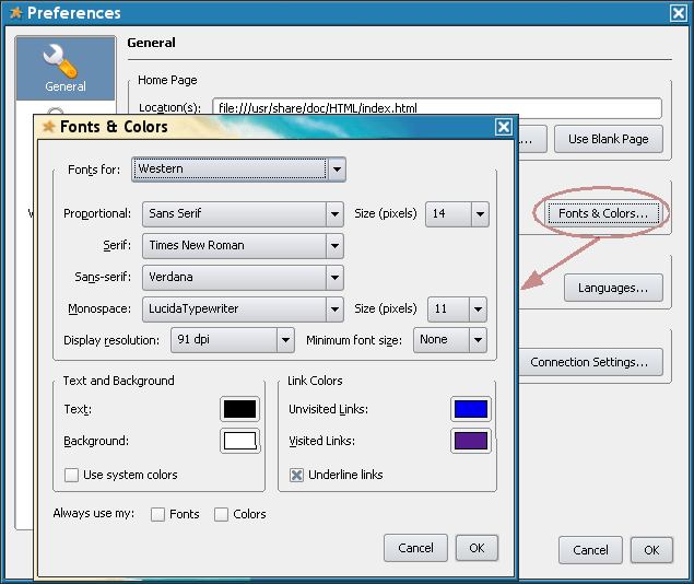
So we -> and then , and selected Verdana 14px for general browsing and LucidaTypewriter 11px for monospace text.
Firefox is a Gnome application, so it will use Gnome's font settings for widgets.
Additionaly, a very interesting way to configure some font rendering aspects of Firefox is described in a Mandrake Wiki.
3.2.6. Beautiful Alternatives Without Webcore Fonts
If you want to stay away from patents and proprietary fonts, the best way to go is with Bitstream Vera Sans 8pt, Nimbus Sans 8 or 9pt, or Luxi Sans 8 or 9pt (also known as Sans, simply) for desktop widgets, and bigger sizes for fluent text reading. You'll need Anti-Aliasing to blur the low quality of the hinting of these fonts.
Here are some screen shots about the usage of these fonts on KDE. You should pay attention on how the widgets text on this window are rendered.
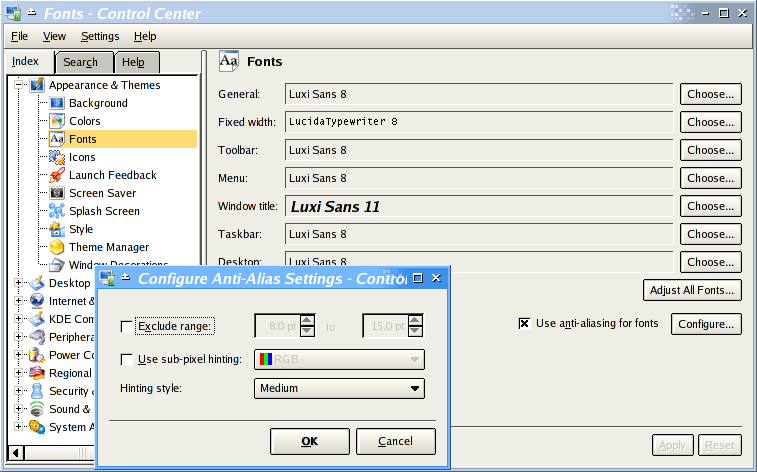
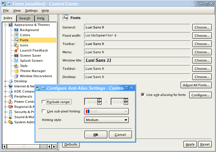
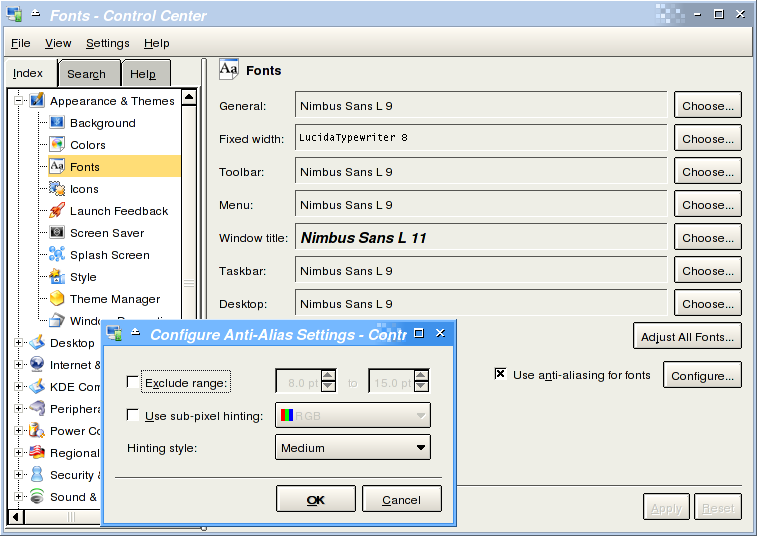
As you can see, the results aren't so good as Tahoma 8pt.